10 best businesses web design references
Exploring the most trendy company web design concept in 2021

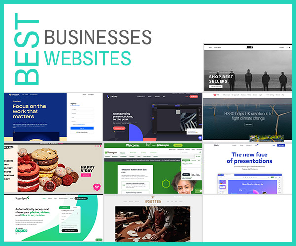
HSBC - Banking Industry
Rationale
- Look & feel of the design: Layout and visual design of this website give a sense of visual hierarchy which users can easily follow the flow of their contents.
- Typography: Usage of Sans Serif font in this website gives a sense of modernity, minimalism and readability.
- Colour: This website uses the combination of cool colour and warm colour wisely. Bright and vivid colours tend to highlight the importance such as the visual box. While cool and dulled colour images use as background.
- User experience: This website is user friendly as they narrow down the information and include the relevance to the target audience which the messages are loud and clear.
5 criteria for evaluating websites: -
- Content: The Hong kong and Shanghai Banking Corporation also known as HSBC is one of the largest banking and financial services organizations in the world. They provide financial services and products to corporates, governments and financial institutions. They offer a full range of banking services to support clients and won numerous industry awards around the world. But in this website, they highlight the climate changes at UK and help them to raise funds.
- Usability: Information are clear enough and the engagement also quite simple to follow.
- Aesthetics: Overlapping contents allow users to feel the visual hiearachy.
- Visibility: Visuals and texts are big enough to view it. They take care of the users especially senior citizens and those who have short-sighted.
- Interaction: Interaction occur when hovering the navigation bar.
Huntington - Banking Industry
Rationale
- Look & feel of the design: Most of the visuals in this website have a smiling face and interaction between each other which users will feel the sense of friendly and positive.
- Typography: This website differentiates their points and content in terms of the size and thickness of the font. They will bold and enlarge the importance and remain standard size for the other contents.
- Colour: They have a strong identity colour which is 90% of green colour and 10% of grey colour. The usage of green and grey colours show a fresh look from the users perception towards banking industry.
- User experience: This website is user friendly as they narrow down the information and include the relevance to the target audience which the messages are loud and clear.
5 criteria for evaluating websites: -
- Content: Huntington provides online banking solutions, mortgage, investing, loans, credit cards, and personal, small business, and commercial financial services. Besides, they also have community involvement which they committed to give back to the community and support the nonprofit organizations.
- Usability: Information are clear enough and the engagement also quite simple to follow.
- Aesthetics: Mostly in green colour which gives a natural, farm core and fresh new look.
- Visibility: Visuals and texts are big enough to view it.
- Interaction: Interaction occur when users hover the mouse to the images in the box. Images will become bigger than usual which drive users to be more likely to engage in this website.


Dropbox - Could Space Industry
Rationale
- Look & feel of the design: Tidy and neat arrangement and layout can be seen in this website. They are taking good care of the white space, margin and layer.
- Typography: Expanded typography for title and heading provide emphasis.
- Colour: Deep sea blue colour is mainly use in this website. Users will feel calm when they enter into this website as blue represent serenity and peaceful based on the colour psychology. While light yellow use to highlight the points. The usage of deep sea blue and light yellow colour in between create a high contrast which standout the points.
- User experience: This website is user friendly as they narrow down the information and include the relevance to the target audience which the messages are loud and clear.
5 criteria for evaluating websites: -
- Content: Dropbox is a file hosting service that offers cloud storage, file synchronization, personal cloud, and client software. Dropbox is free to use but they have also provided many plans for personal and business use.
- Usability: Information are clear enough and the engagement also quite simple to follow.
- Aesthetics: Minimalist aesthetic can be seen as the style is simple and easy to understand.
- Visibility: Appropriate white space and colour usage lead to high visibility.
- Interaction: Parallax scrolling effect occur when scrolling down to the website.

SugarSync - Could Solution Industry
Rationale
- Look & feel of the design: Minimalism can be observed in this website. Besides, there is a bold and thick green and grey colour line which lead users’ eyes follow the flow and direction to read the contents.
- Typography: Sans serif font in this website give off a feeling of being casual, friendly and approachable which mainly due to the minimalistic design. They use bigger font size to highlight their importance.
- Colour: Green, black and some grey colours can be seen in this website. They use green colour to emphasize the point and grey colour as background colour to support the points.
- User experience: This website is user friendly as they narrow down the information and include the relevance to the target audience which the messages are loud and clear.
5 criteria for evaluating websites: -
- Content: SugarSync is a cloud file sharing, file sync and online backup service that is simple, powerful and easy to use.
- Usability: Information are clear enough and the engagement also quite simple to follow.
- Aesthetics: Minimalist aesthetic can be seen as the style is simple and easy to understand.
- Visibility: Visuals and texts are big enough to view it. They take care of the users especially senior citizens and those who have short-sighted.
- Interaction: Interaction occur when users hover the mouse to the images in the box. Images will become bigger than usual which drive users to be more likely to engage in this website.

Wootten - Fashion Industry
Rationale
- Look & feel of the design: Users will strongly feel the sense of “wooden”.
- Typography: Combination of serif, sans-serif and brush script typographies convey a fresh new look towards the woods.
- Colour: Grey and brown colours are used in this website which allow users to feel muted.
- User experience: This website is user friendly as they narrow down the information and include the relevance to the target audience which the messages are loud and clear.
5 criteria for evaluating websites: -
- Content: Wotten is a company that produce variety of shoes, bags and aprons.
- Usability: Information are clear enough and the engagement also quite simple to follow.
- Aesthetics: Vintage style occur.
- Visibility: Images and texts are appropriate in size enable the visibility.
- Interaction: There is a grey-scale when hovering the images.

TRUE Linkswear - Fashion Industry
Rationale
- Look & feel of the design: The whole website evokes minimalism and modern style which they have enough space.
- Typography: Expanded typography has been used to increase the readability and provide emphasis.
- Colour: Dark colours such as black and grey are mostly used in this website as it these colours represent modernism.
- User experience: Informative and interactions increase the user experience.
5 criteria for evaluating websites: -
- Content: TRUE Linkswear manufacture comfortable, durable and versatile golf shoes for the walking golfer.
- Usability: Information are clear enough and the engagement also quite simple to follow.
- Aesthetics: This website gives a sense of elegant, high-class feelings towards users.
- Visibility: All the information are center aligned which lead to a
- Interaction: There is an image and Instagram icon when hovering the images. This creates an interesting engagement between users and website.
Picth - Digital Industry
Rationale
- Look & feel of the design: Although this website consists many elements inside, but users will feel comfortable as they arrange all the contents properly.
- Typography: Sans serif font in this website give off a feeling of approachable which mainly due to the minimalistic design. They use bigger font size to highlight their importance.
- Colour: Combination of the colours and white spaces give generous feeling.
- User experience: This website is user friendly as they narrow down the information and include the relevance to the target audience which the messages are loud and clear.
5 criteria for evaluating websites: -
- Content: Pitch is good presentation software, enabling modern teams to craft and distribute beautiful presentations more effectively.
- Usability: Information are clear enough and the engagement also quite simple to follow.
- Aesthetics: Combination of purple, pink and blue give a sense of vaporwave, some sort of new ”retro”.
- Visibility: Visuals and texts are big enough to view it.
- Interaction: Parallax scrolling effect occur when scrolling down to the website.

Milk Bar - Food industry
Rationale
- Look & feel of the design: This website give a brighter and positive feeling towards users.
- Typography: Sans serif font and bold typography for title has been used which enhance the readability.
- Colour: Milk colour for the background gives a sense of softness, sweetness and girly. While the visuals are in vivid colour which brighten viewers’ eyes.
- User experience: User experience can be seen in placing order within the website.
5 criteria for evaluating websites: -
- Content: Milk Bar is an award-winning bakery known for its familiar sweet desserts.
- Usability: The guidance is clear enough which users will understand easily.
- Aesthetics: This website gives a sense of “Insta” filter.
- Visibility: The images are in high resolution which viewers can view the details easily.
- Interaction: Interaction can be seen in navigating the menu bar.


Seattle Cider Co - Food industry
Rationale
- Look & feel of the design: Concept of tree, jungle and forest capture the spirit of this website and it evokes a natural way.
- Typography: This website has use sans serif font as content and brush script font to highlight their title. Appropriate sans serif font match with the overview of this website which lead to the readability. Brush script font also seems match with the theme of this website too.
- Colour: Muted colour has been use in this website. It has an emotional effect towards the users as it signifies something old and precious.
- User experience: This website is user friendly as they narrow down the information by the logos and include the relevance to the target audience which the messages are loud and clear. Besides, texts, images, icons and graphic elements are works well together which engage the users at every touchpoint.
5 criteria for evaluating websites: -
- Content: Seattle Cider Company is Seattle’s first cidery that manufacture cider using grown apples to bridge the gap between wine and beer. They have few community partners to keep supporting their efforts meanwhile collaborate with non-profit organizations to foster the local community.
- Usability: This website is simple, user friendly which lead to a high usability.
- Aesthetics: This website captures the mother of nature.
- Visibility: Visuals and texts are big enough to view it. They take care of the users especially senior citizens and those who have short-sighted.
- Interaction: Scrolling through the illustrations, there is a number of parallax effects, moving the elements that makes up this interaction.
Conclusion:
Planning to get an effective and competitive brand new website? you have to do a proper research that how to choose the best web design company and web design price, Exploring what is the best web design trends for coping as per market needs on, top of that, the web design agency must have a comprehensive role team players such as experience web & digital consultant, web designer, web developer & etc.
What’s the Difference between web designer and web development? A business website design will involved in few major elements which it aesthetics, usability, interaction, visibility & web interface.
